A human brand for
Selkirk Pharma

Selkirk Pharma is a pharmaceutical manufacturer rooted in team, relationship, and community, while also operating in a high-tech, precise environment. Our challenge was to create a brand identity that balanced these values with trust, expertise, and longevity.
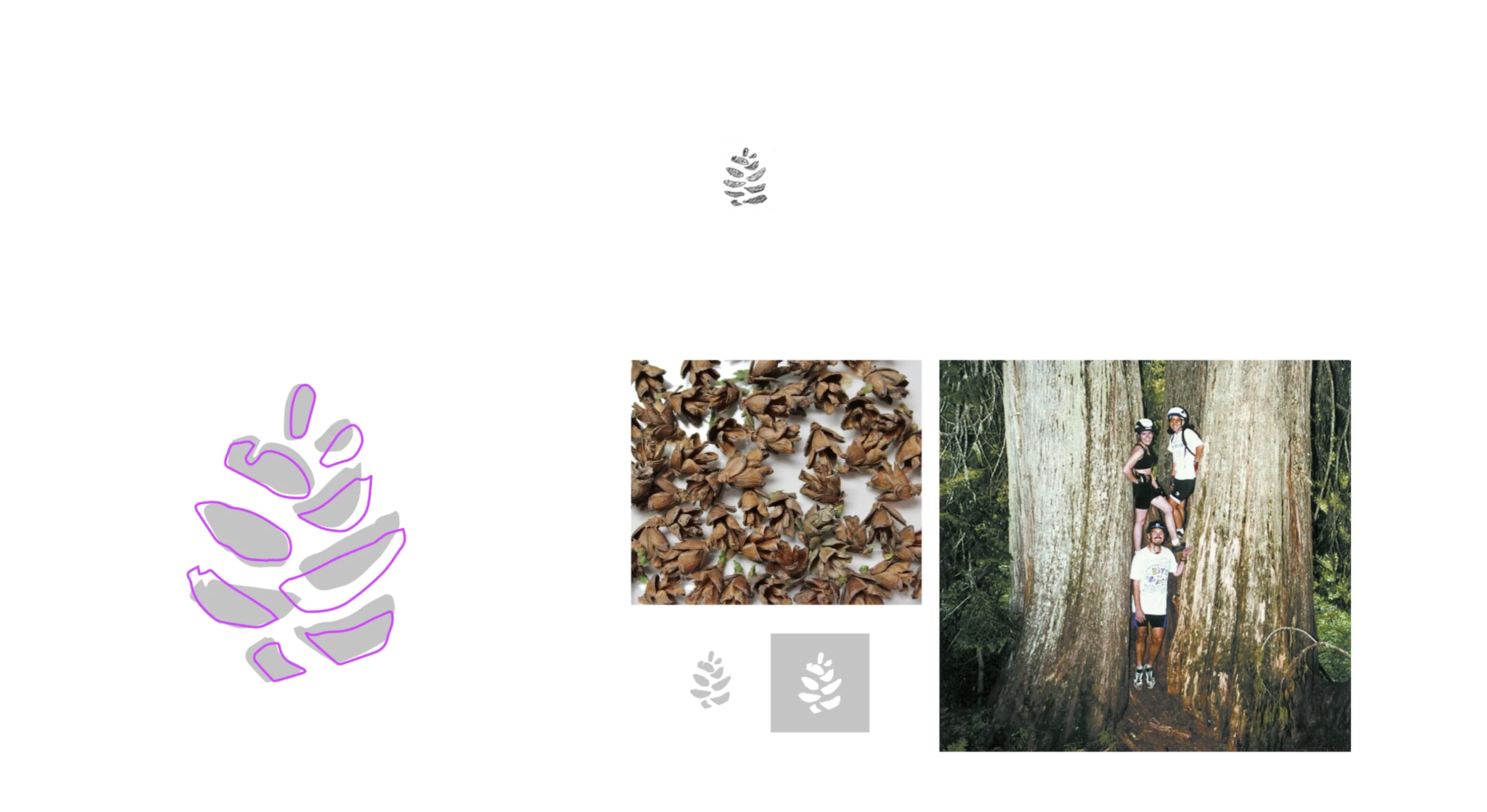
We developed a visual identity inspired by the Western Red Cedar, a tree native to the Selkirk Mountains. These trees, known as the ‘tree of life,’ grow to over 200 feet tall and live for over a thousand years. They symbolize strength and longevity, yet they begin as humble 1cm pine cones—mirroring Selkirk’s own journey.
Research
To get the ball rolling, we researched Selkirk’s business and human values, interviewed their founding team, and analyzed competitors for patterns and opportunities.
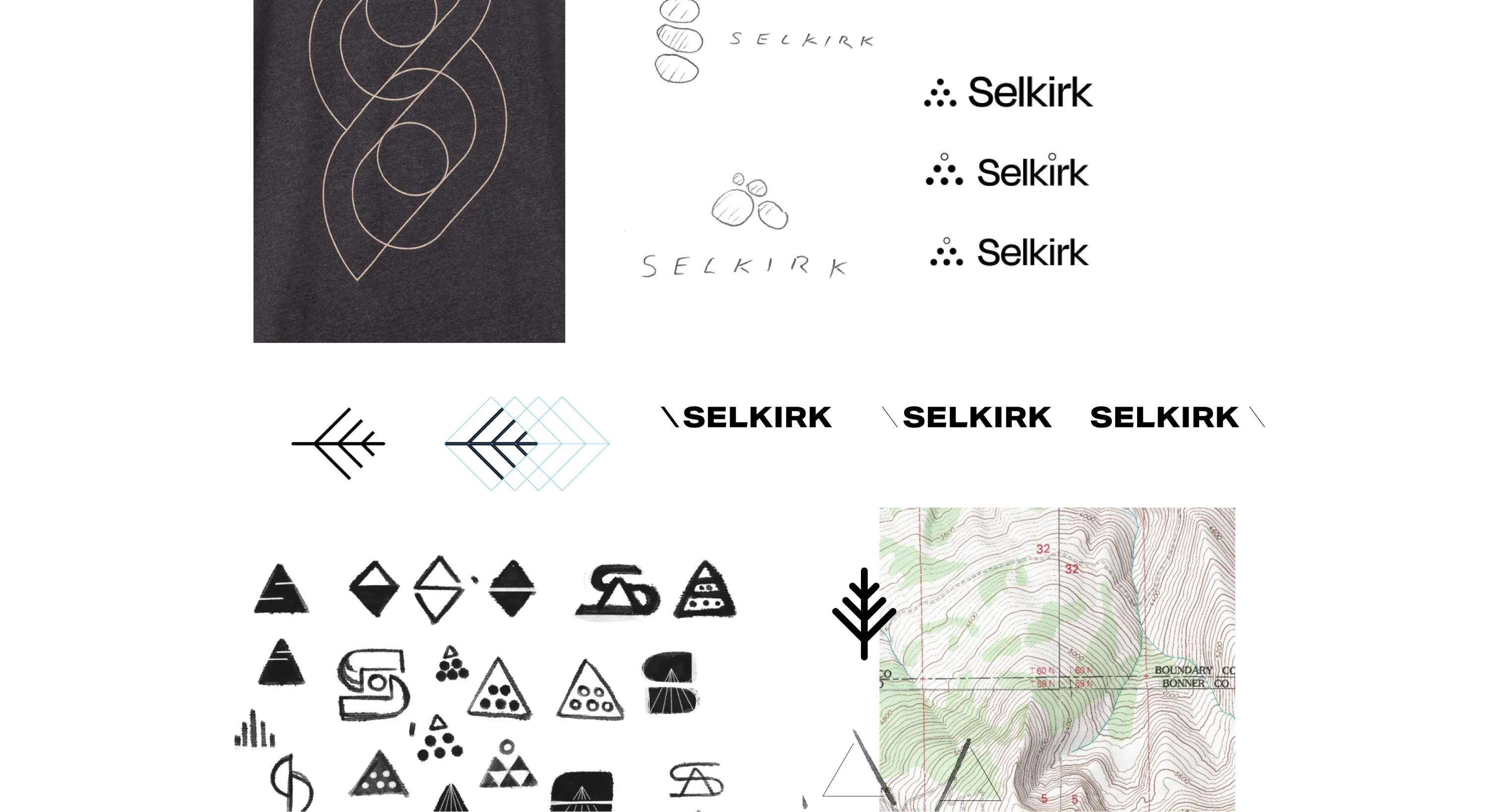
Pen to paper
There were other ‘human-centric’ pharma companies, but we saw an opportunity to position Selkirk as a more approachable brand. The challenge was to achieve this while also conveying their expertise and ambition to be ‘the Mercedes-Benz of aseptic manufacturers.’
Storytelling
The story came together when we discovered the Western Red Cedar.
These giants, native to the Selkirk Mountains, are known as the ‘tree of life.’ They grow to over 200 feet tall and live for over a thousand years. They symbolize strength and longevity, and are an anchor for the surrounding ecosystem.
Yet they begin as humble, 1cm pine cones.
This brand story connected deeply with Selkirk’s founders.
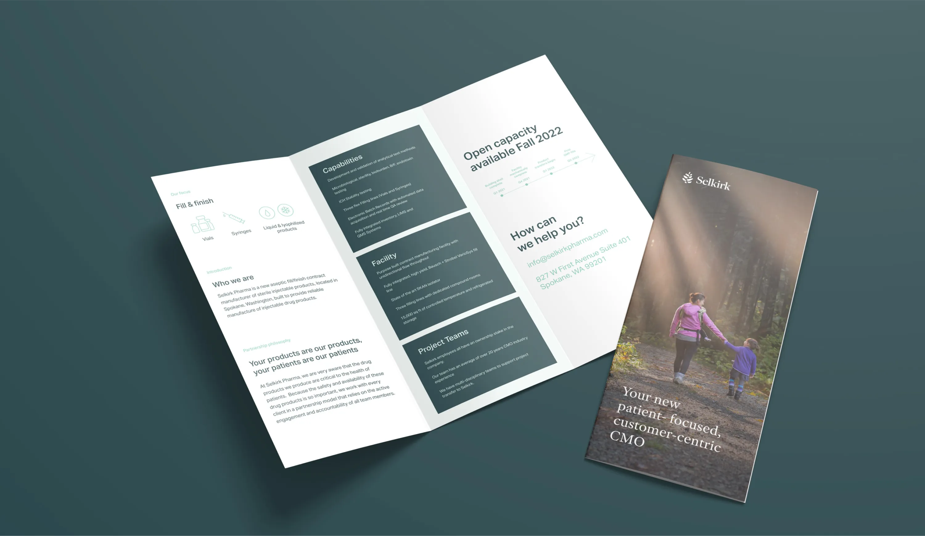
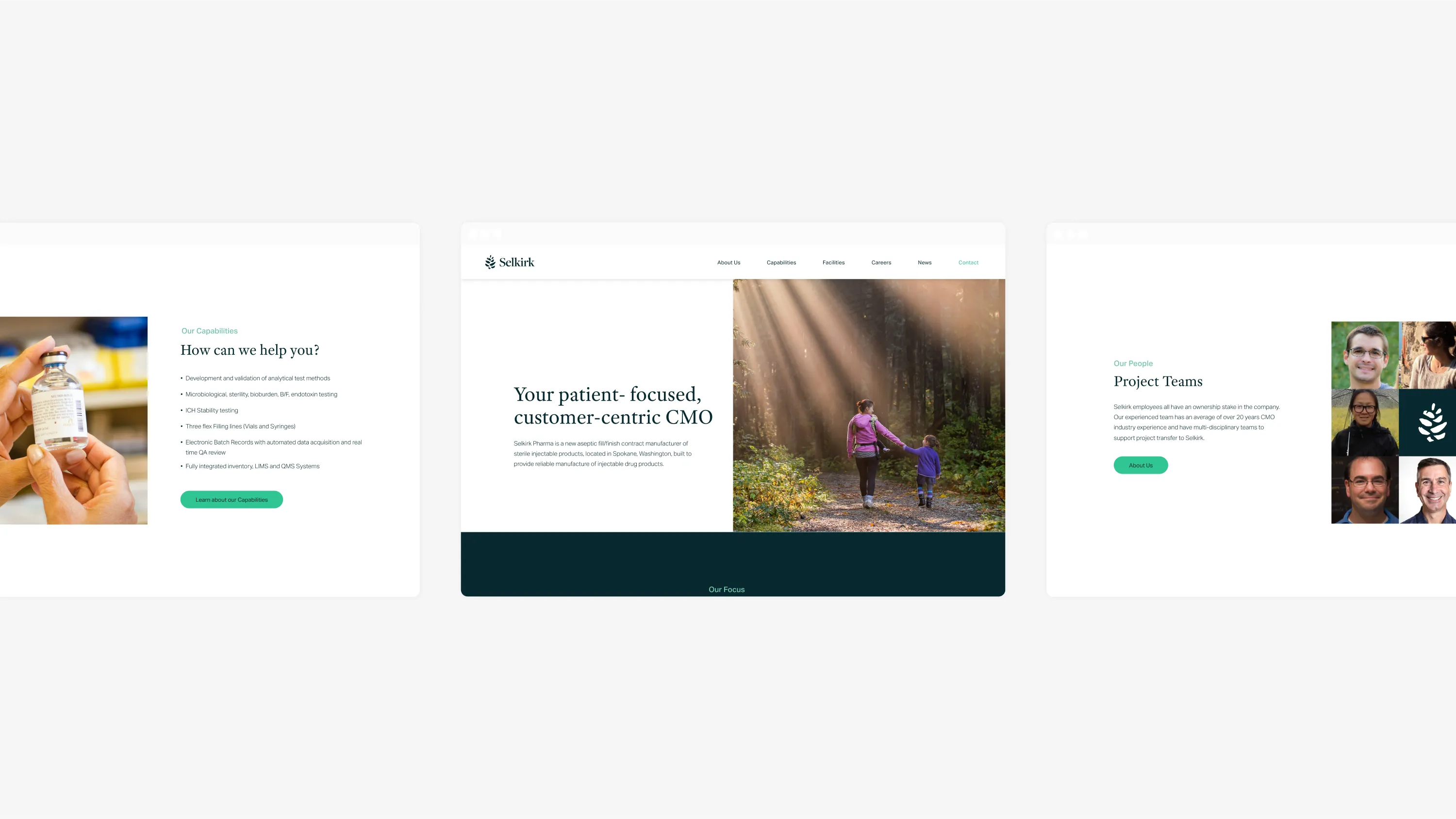
Results
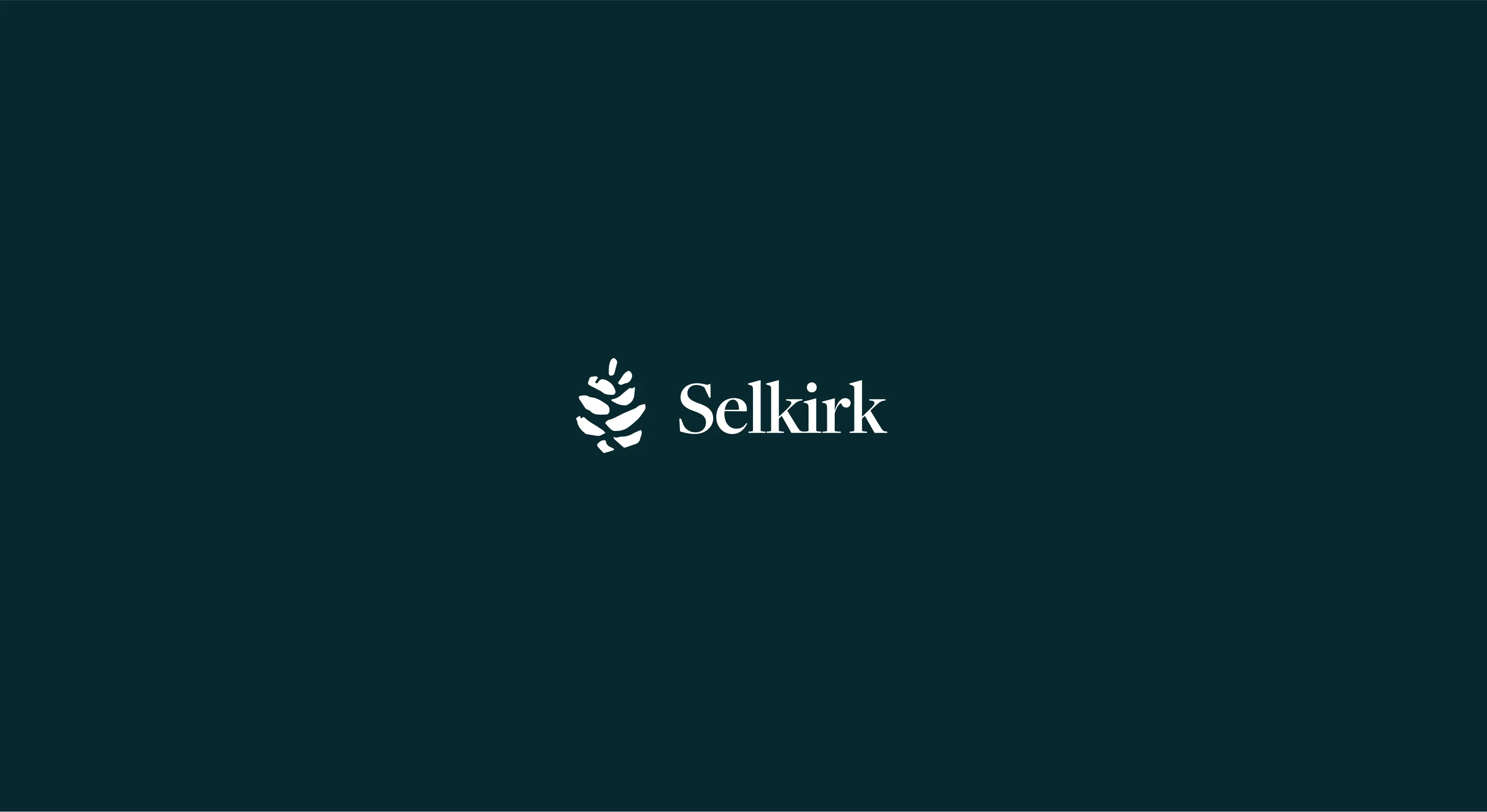
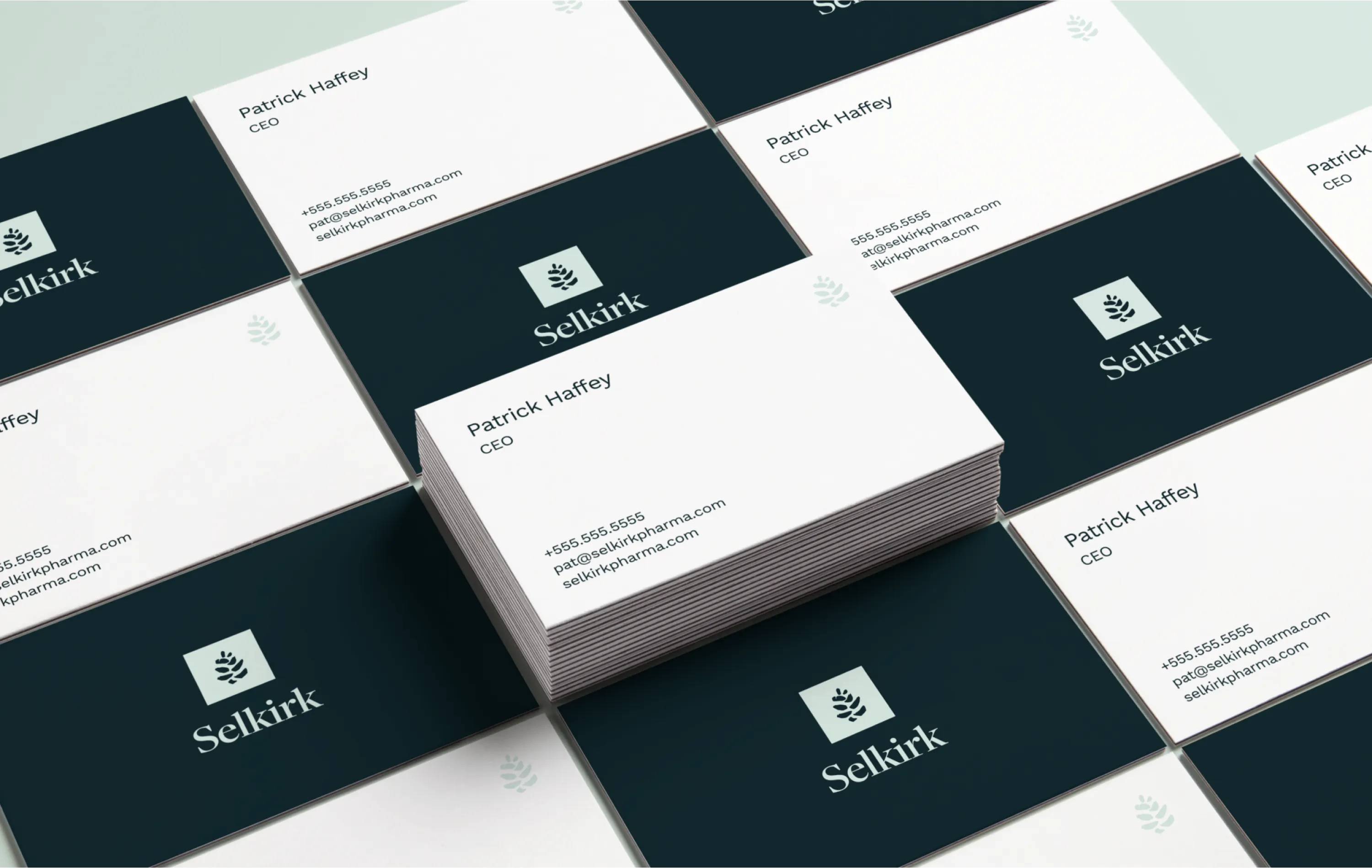
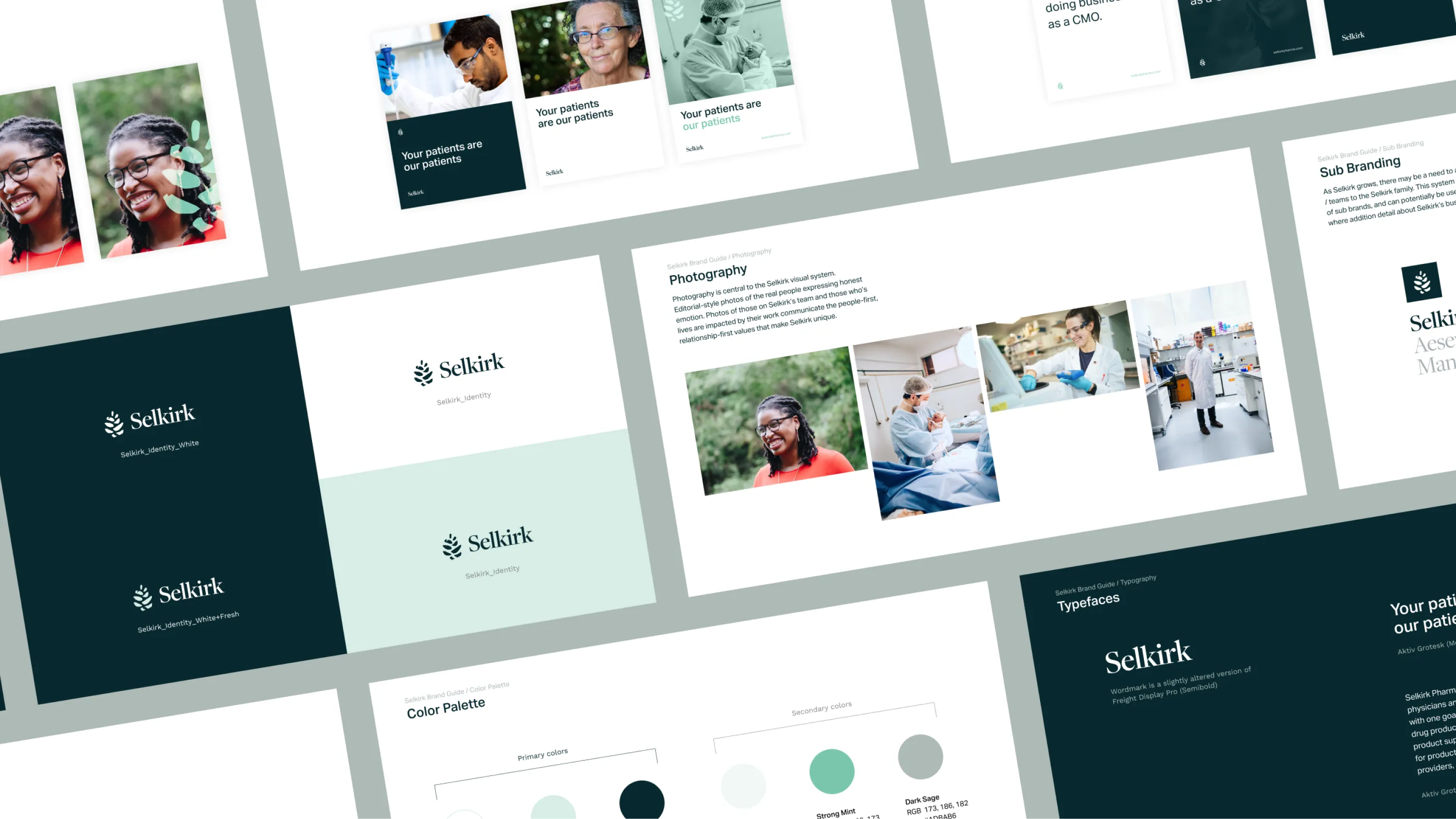
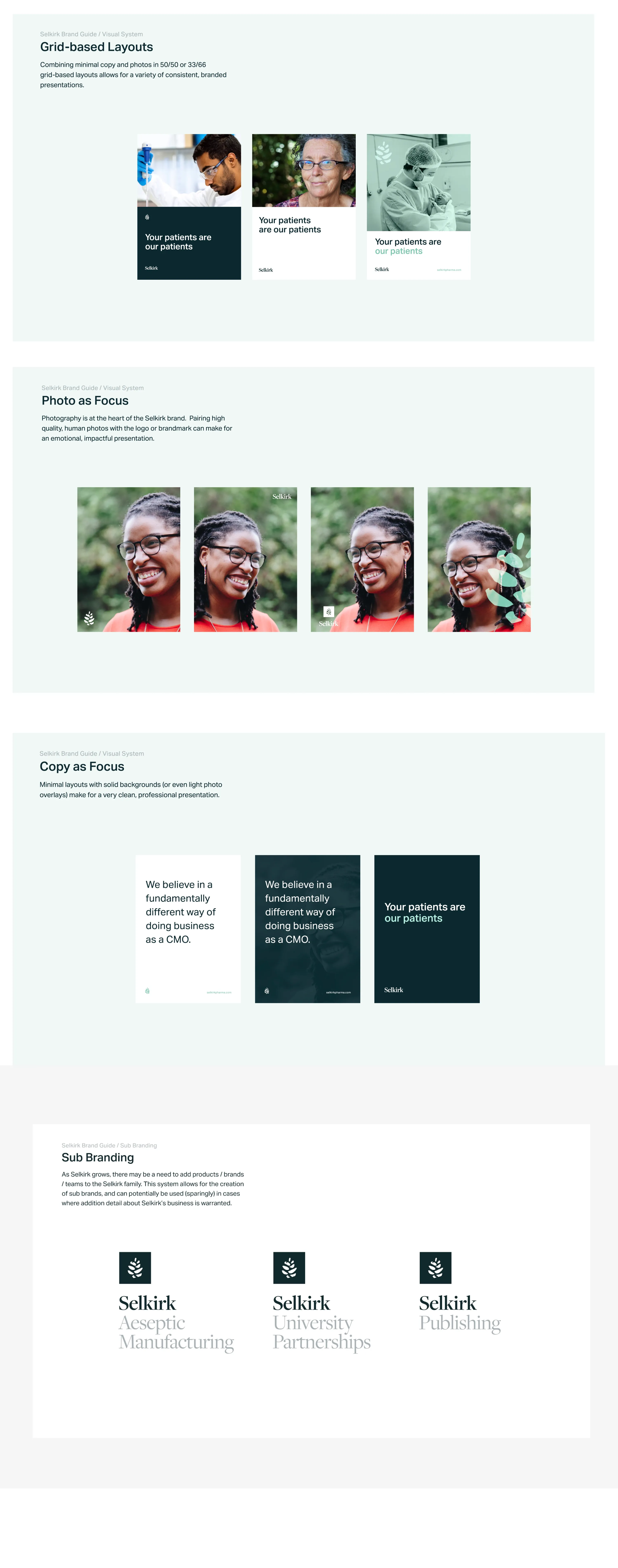
The final mark is refined, but retains the human, hand-drawn imperfections. The serif font leans into the ideas of “legacy,” trust, and esteemed traditional institutions like universities, research centers, publishers.
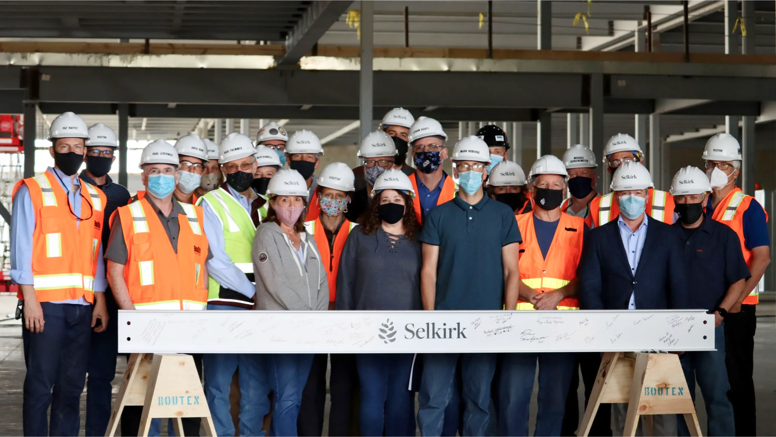
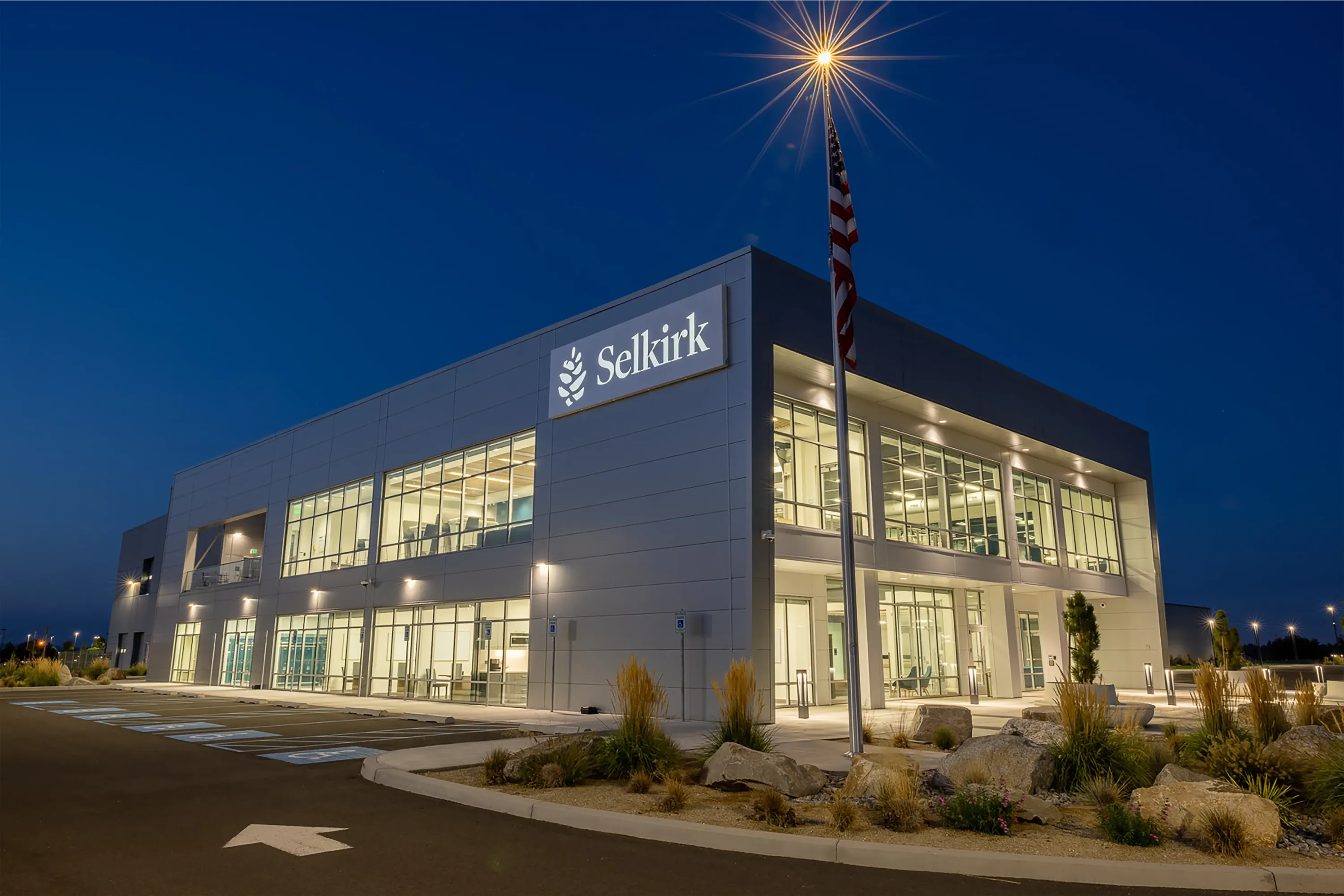
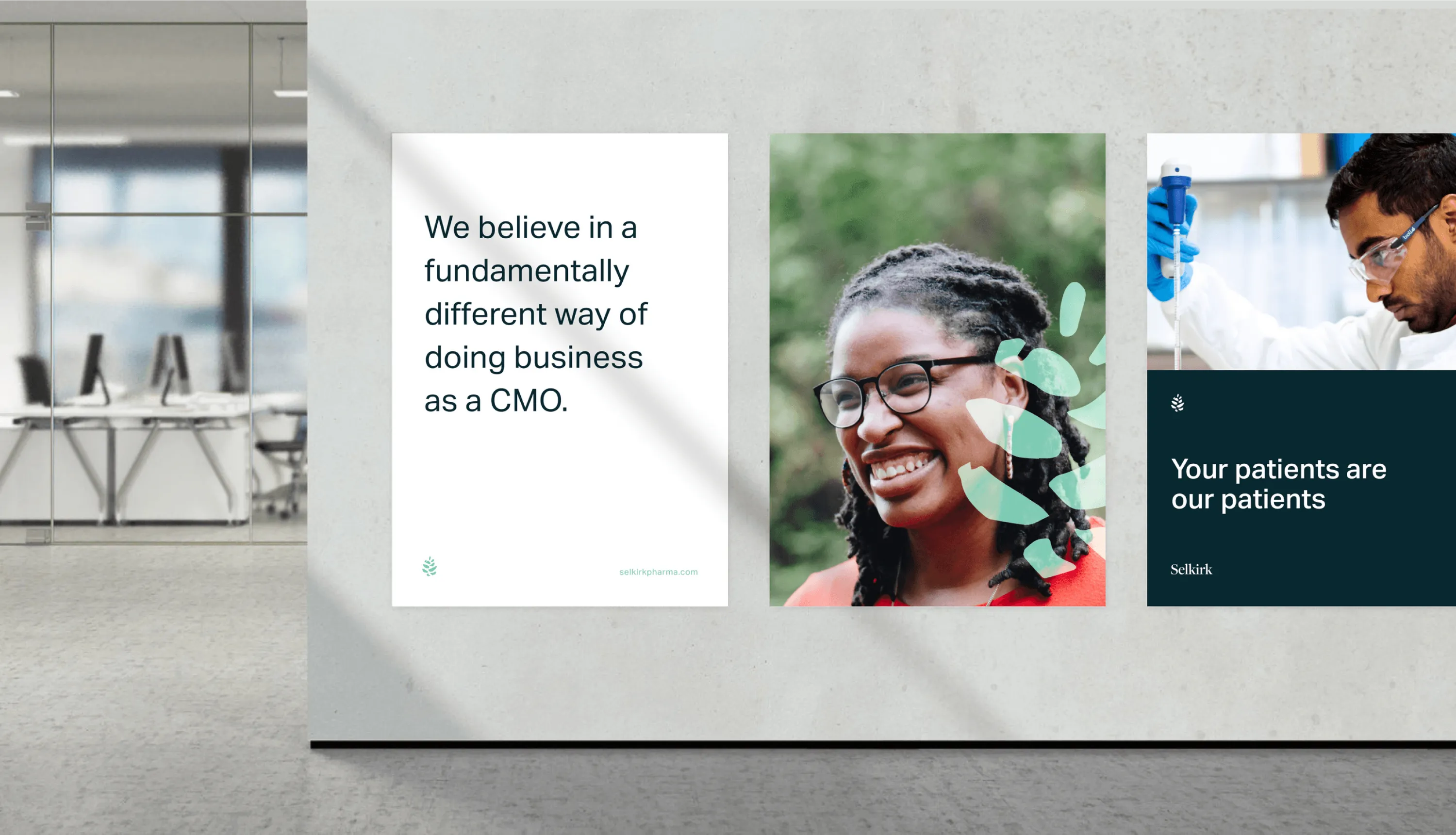
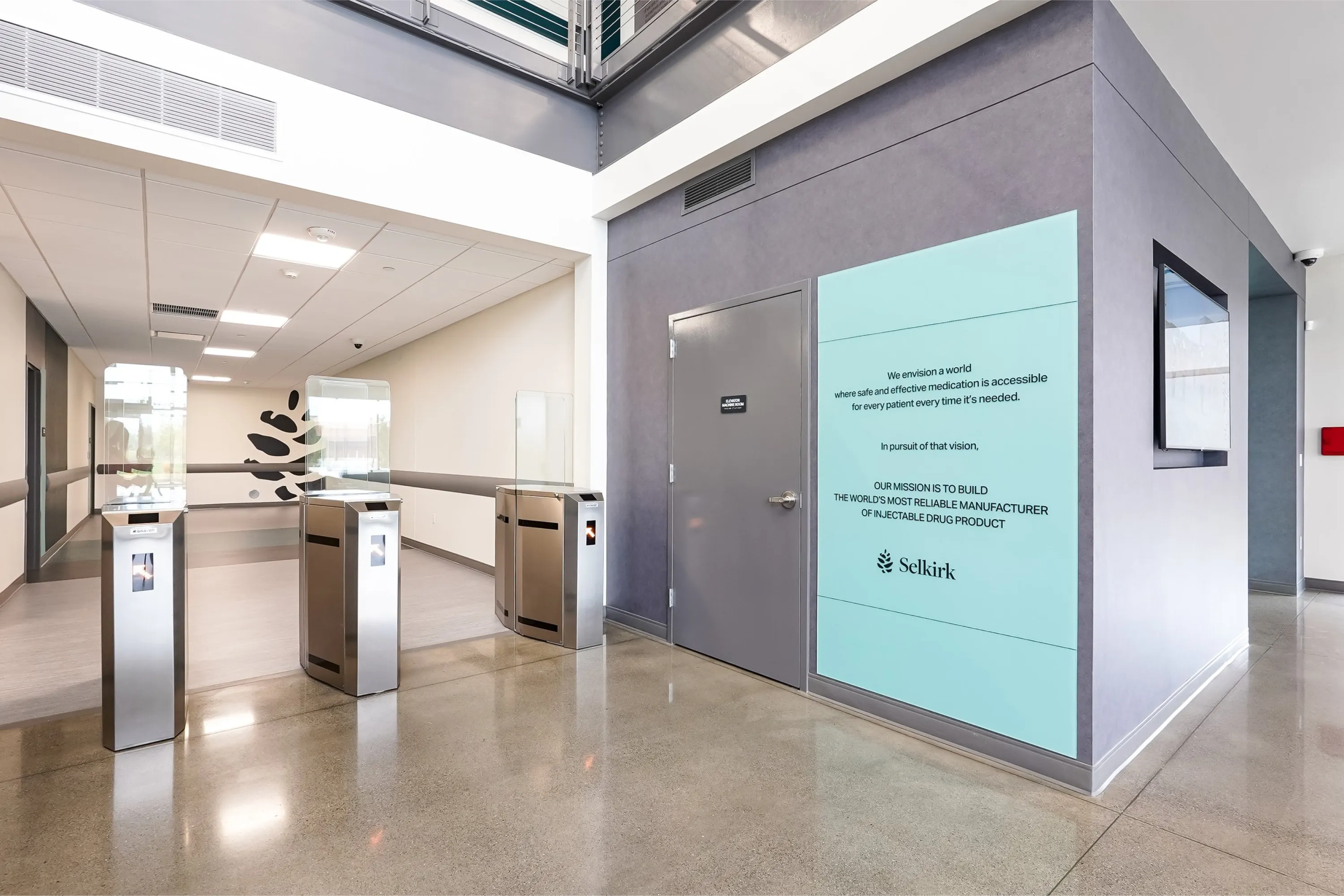
Extending
The Selkirk team was so taken with some of our Brand In Use interior mockups that they ended up applying them inside their brand new facility. The crown jewel is the story of the Western Red Cedar, hanging in their lobby.