An authentic visual language for Khan Academy

Khan Academy was rebranding, and our team used this opportunity to reassess its visual expression. We aimed to create a visual identity that effectively communicated KA’s values and personality while being flexible enough to resonate with diverse audiences. The resulting style was able to:
1) clearly convey KA’s values,
2) adapt to a wide range of subjects, and
3) scale efficiently, considering resource and staffing constraints.

Audit
Our team performed an audit of all current KA brand visuals and scored them against KA’s Brand Values.

Exploration
And we began exploring, with flexibility and scalability at the forefront of our minds...

Stress-testing
As a certain style would prove promising, we’d collaborate with product designers to stress test the direction...

But...
But I kept wondering... where are we going? I couldn’t identify our north star.

Time's up :/
As time expired for our sprint, we delivered a visual system that was more playful and engaging, more joyful and flexible...

Visual identity guidelines
We delivered guidelines for the creation and implementation of this new style, and started building out systems to help it scale, like illustrations libraries. But the whole style lacked a cohesive story and intention.

Back to the basics
The new identity system didn’t feel right, so I went back to the basics. What was our North Star? What makes an identity system effective? Drawing inspiration from sources like Designing for Emotion, I identified key principles to guide our approach.
1.
People seek connection, looking for faces or human ‘fingerprints.’
2.
Photography is a powerful tool for fostering this connection.
3.
When connection is made, engagement, learning, retention, user bond, grit, and empathy all increase.

Show the fingerprints
I also drew inspiration from Jon Ying’s design philosophy (of Dropbox fame), which emphasized that:
1.
Simple drawings, like stick figures, connect universally on a human level.
2.
Imperfections and ‘fingerprints’ reveal the creator, fostering a deeper connection with the user.
3.
At Dropbox, this approach increased user empathy and loyalty.

Moment of truth
Now we were making progress. Through this new lens, I realized:
1.
There was significant overlap between Emotional Design principles and Khan Academy’s focus on Growth Mindset.
2.
The value of visually expressing imperfect, rough thought.
3.
As our VP of Design, May-Li Khoe, noted, KA’s videos were already a successful example of Emotional Design and human connection.

With fresh eyes
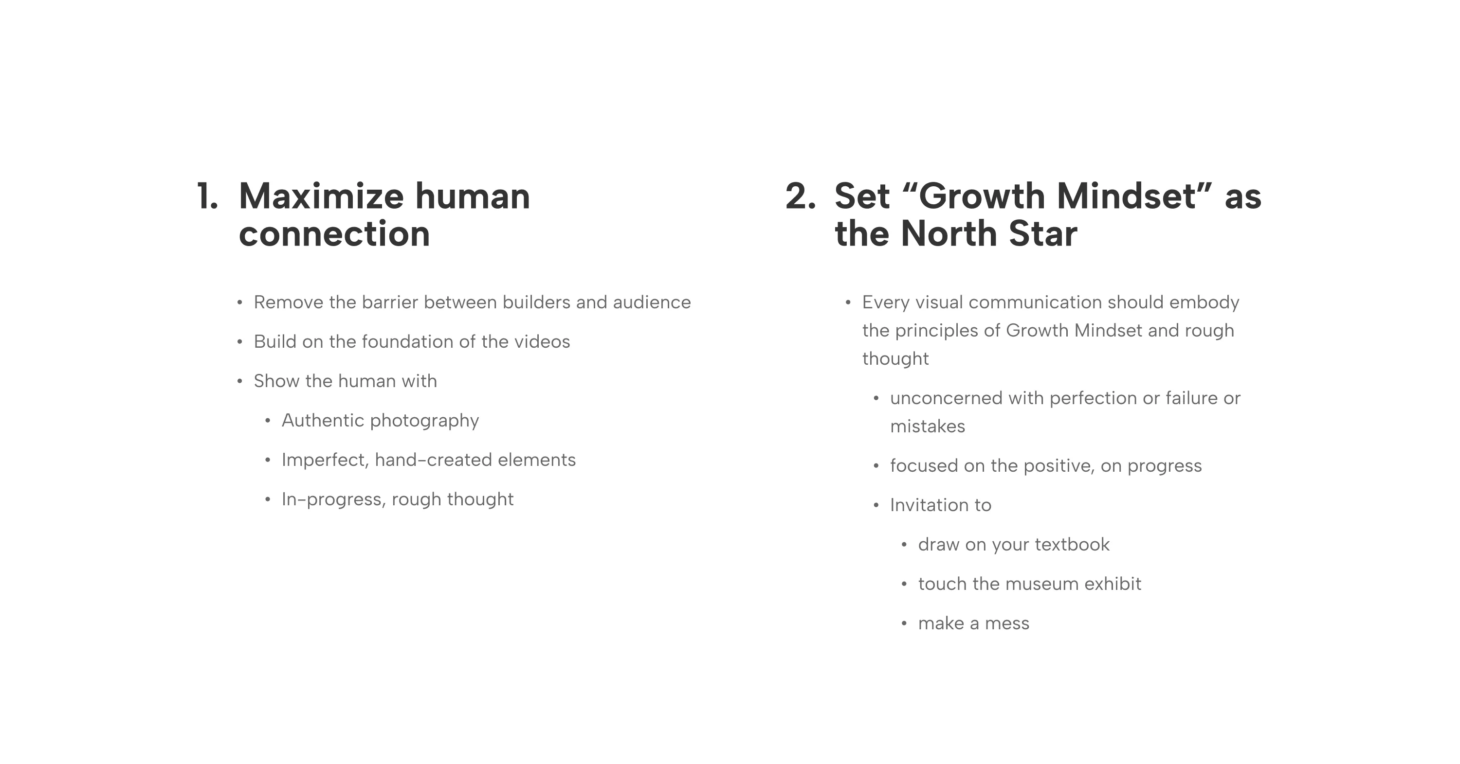
With this new perspective, we redefined the visual expression like so:
Visual Identity, take 2
Working closely with the head of Brand Design, Warren Schultheis, we started a new exploration, kicking ideas back and forth.

Homepage Redesign
As we continued exploring, we began designing the new KA homepage.
Where the old style demanded geometric perfection, the new style embraced imperfection.
Where the old style relied on flat vector illustrations, the new style centered around authentic, editorial photography of real teachers and students.
Where the old style created a wall between KA’s learners and creators, the new style connected the humans on either side of the screen, inviting learners in.

Scalable illustration system
We defined a style for creating imagery that was truly expressive, flexible, and could be delivered by folks with a wide range of skillsets.

Emotional photography
We defined a new, authentic, editorial photo style to bring teachers, students, and the classroom setting into KA’s product and marketing.

Type Update
And we even implemented a new typeface (Source Serif Pro) that projected a higher level of maturity while still being approachable.

Built for speed
We built out new libraries of resources to scale the system and increase efficiency.

Watching it grow
Having defined this new Visual Identity foundation for Khan Academy, it’s incredible to see where it started and how it continues to evolve and improve, becoming more engaging, authentic and expressive than anything we had envisioned!
